Trooh is a media company originally focused on three core markets in the USA:
Women 18+ (Women’s Salons)
Men 18+ (Barbershops)
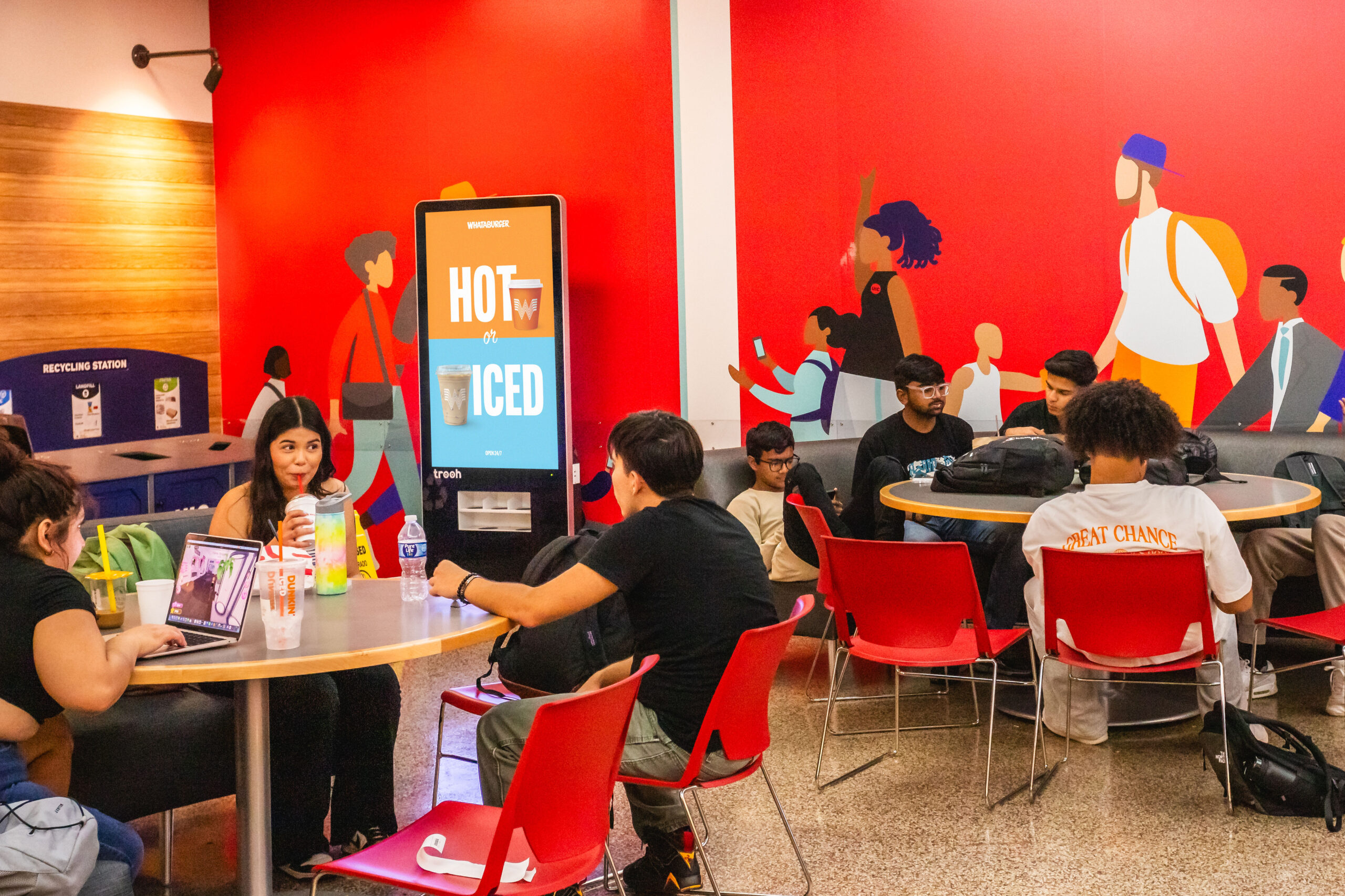
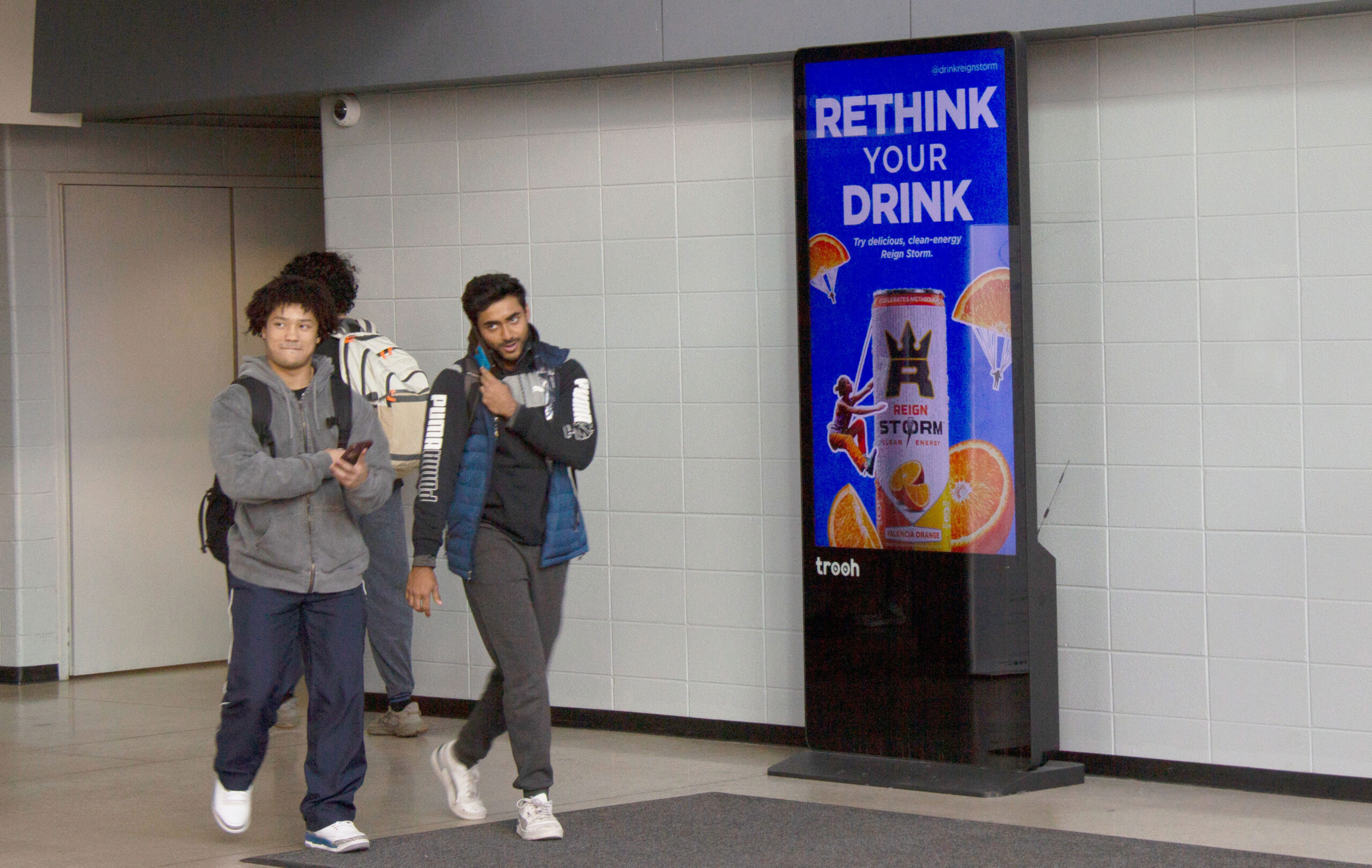
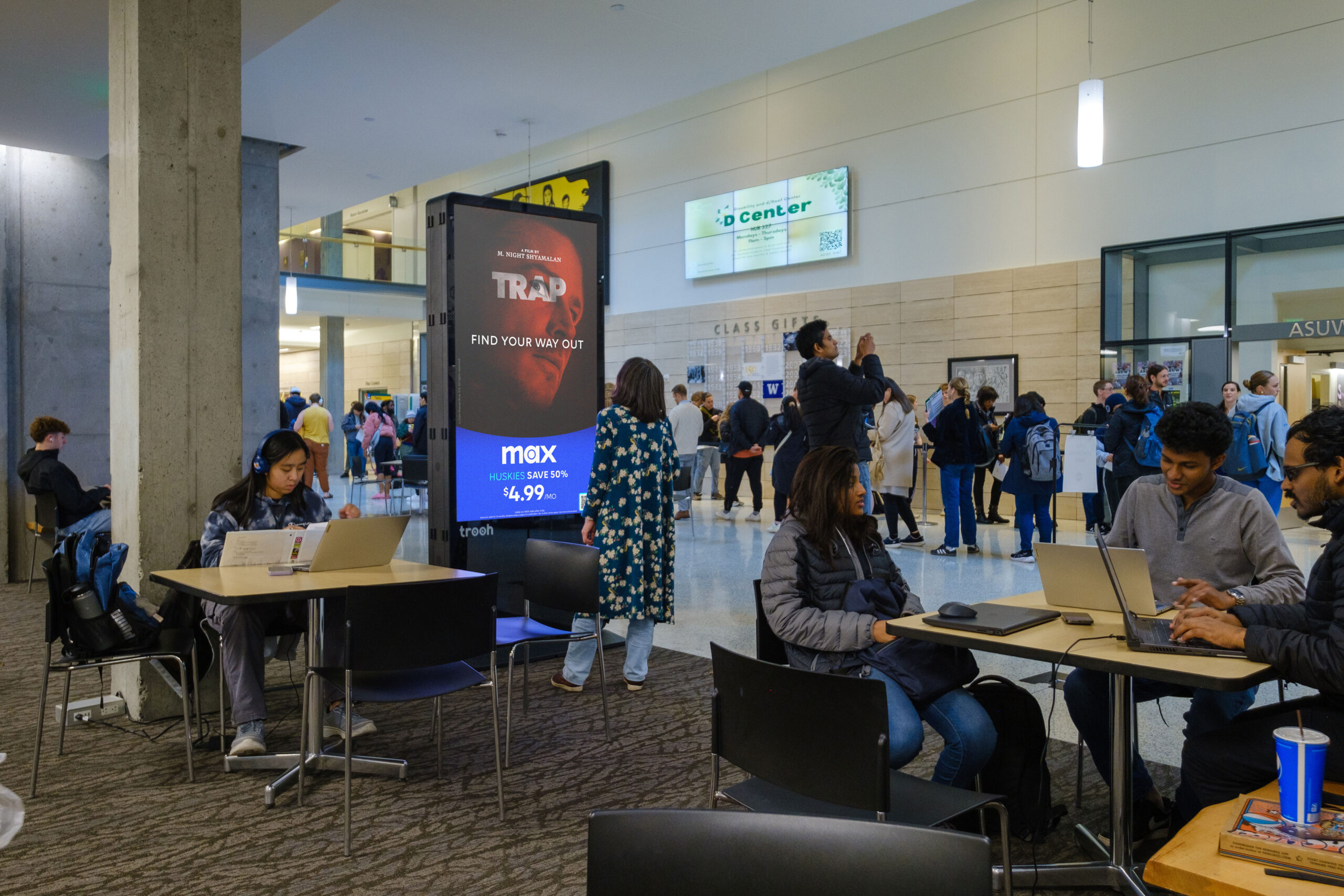
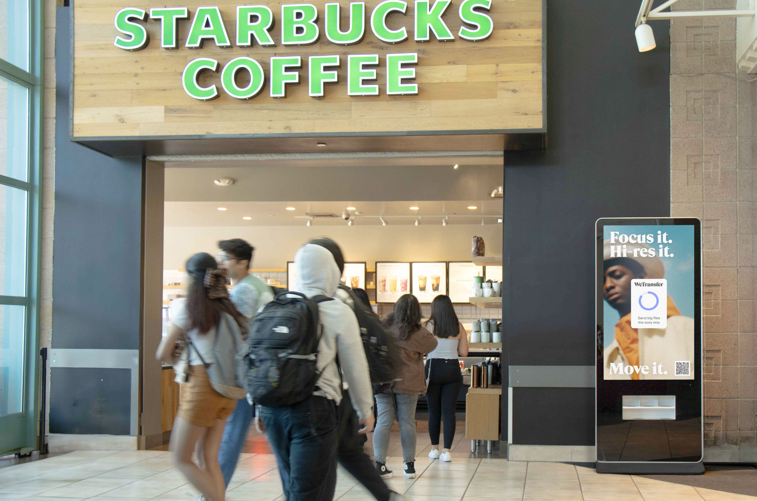
Adults 18-24 (Colleges and Universities)
A strategic decision was made to shift away from salons and barbershops and concentrate on Trooh’s core strength: the Campus Media Network.
The objective was to reposition Trooh as a leader in real-world Gen Z engagement. This meant moving from traditional place-based advertising to large-format digital screens, creating authentic, impactful connections with 18-24-year-olds during their everyday campus experience.
Starting with the logo
I kept the original logo to preserve the brand’s legacy while giving it a more professional edge by making black the main color. We moved away from the original palette but allowed the brand to coexist with secondary colors that represent the spectrum of brands that can take over the screen. We are not here to compete but to be an ally, an off-screen presence ready to come to life with the colors of your brand.
Finally, I added a new element for this era: blinking eyes, conveying dynamism, evolution, and freshness.
Tone of Voice Definition
With our new focus on campuses and as a B2B company, I crafted a tone that expresses our expertise while addressing three distinct audiences:
The Brands
The Colleges
The Students
Brand Persona
The Cool Teacher
Trooh embodies the spirit of the “cool teacher,” blending youthful energy with seasoned wisdom. Like your favorite teacher, Trooh brings a vibrant personality and stays tuned to the trends and cultural values that resonate with Gen Z.
Behind the trendiness lies deep experience. Trusted by brands, students, and colleges alike, Trooh acts as a mentor guiding advertisers through the challenges of connecting with their audience. It strikes the perfect balance between enthusiasm and insight, earning respect on the path to reaching the next generation of consumers.
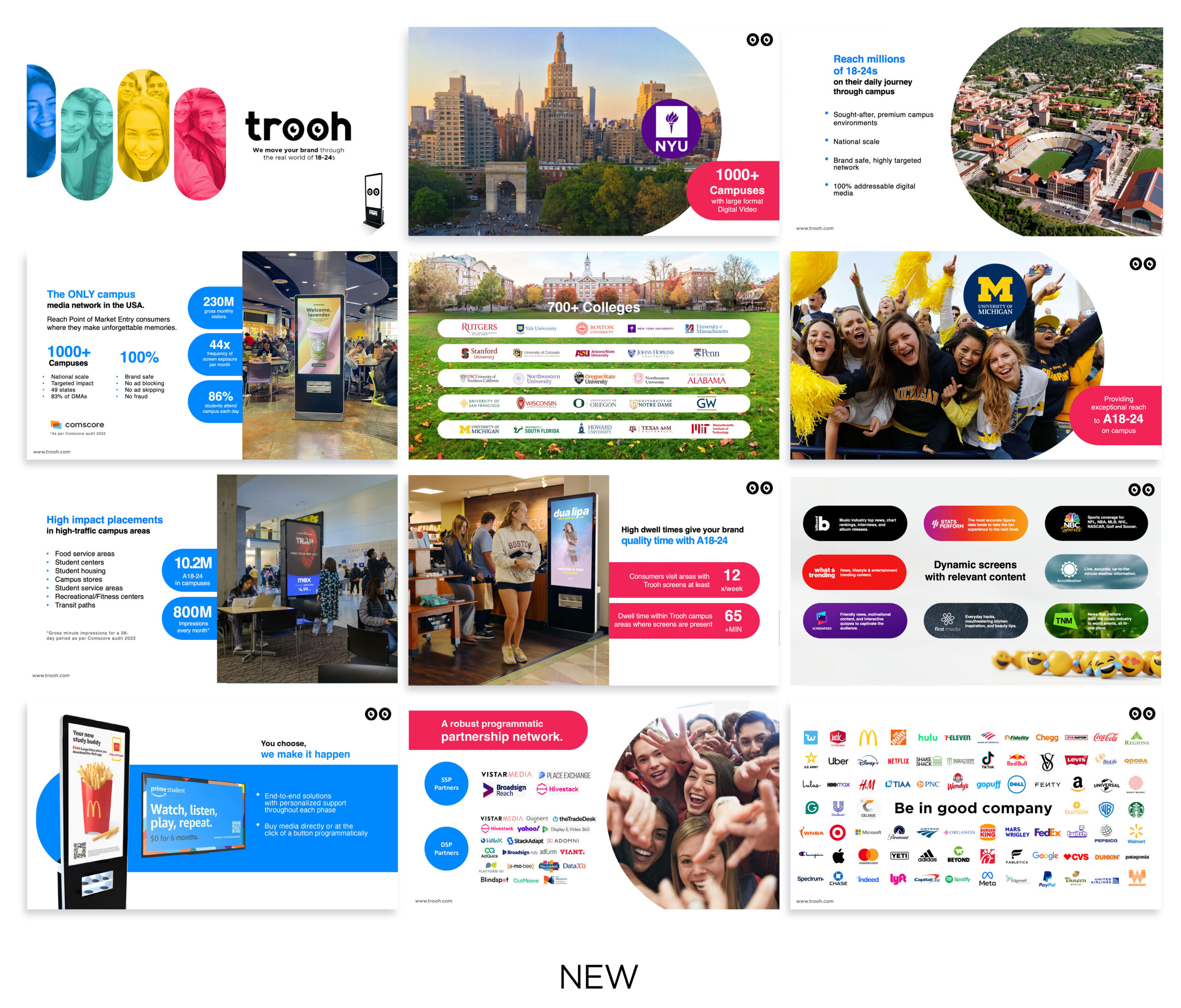
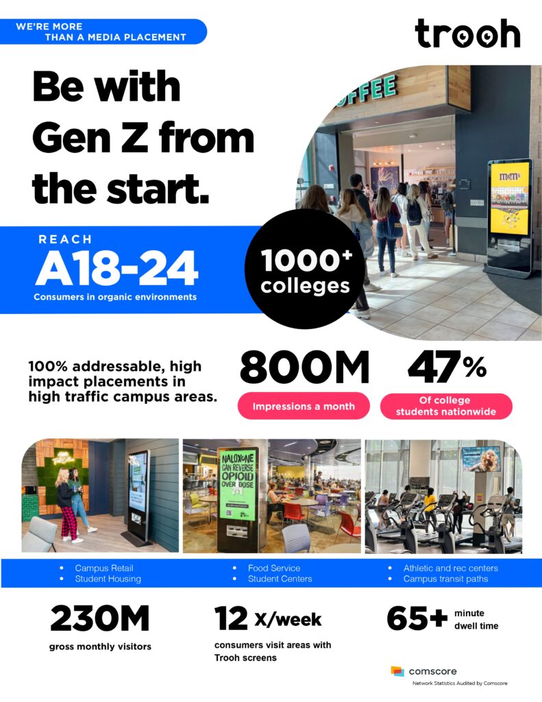
The Media Kit
To match our refined persona and tone, I redesigned the media kit to be more visually compelling, well-organized, and impactful.
Website Redesign
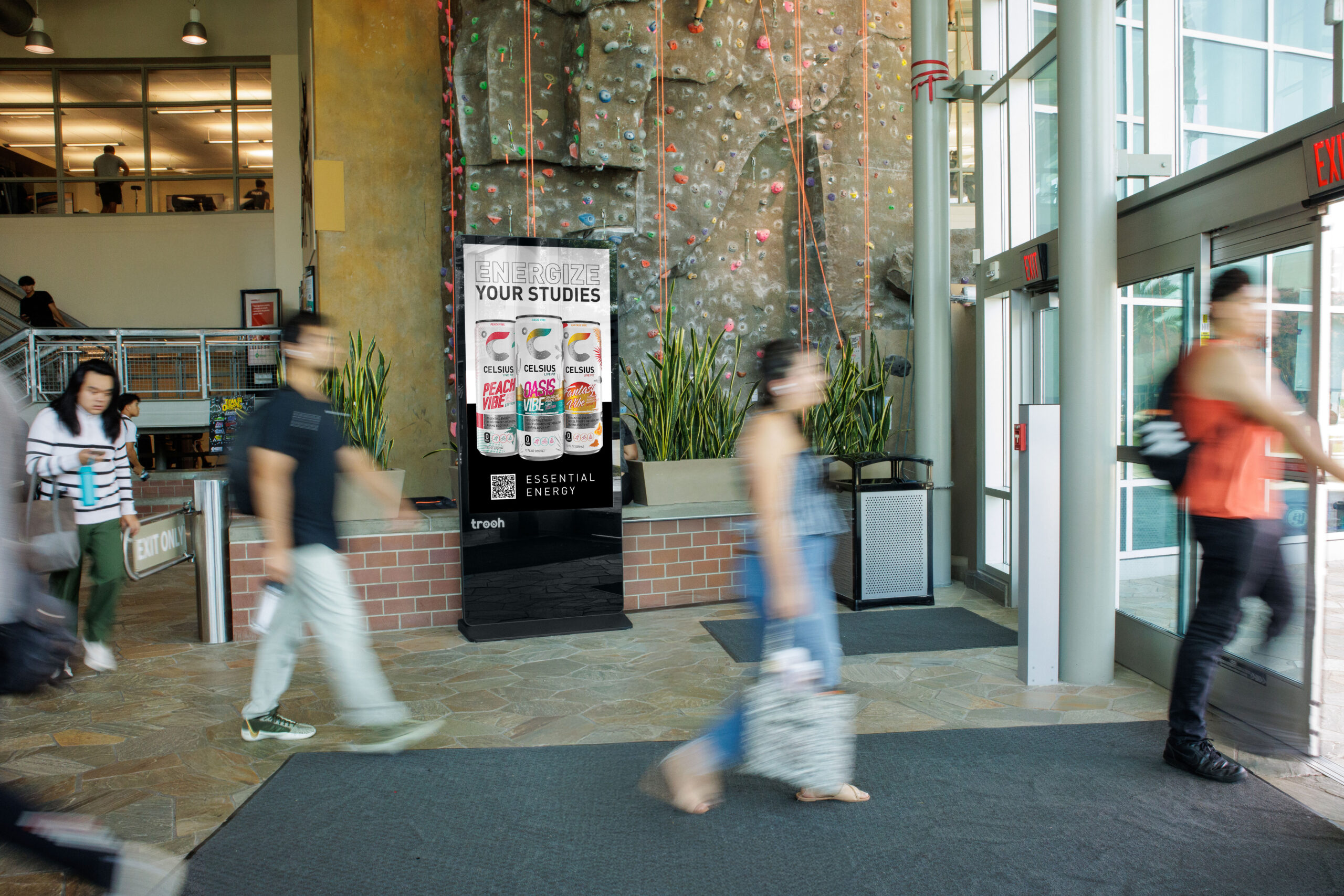
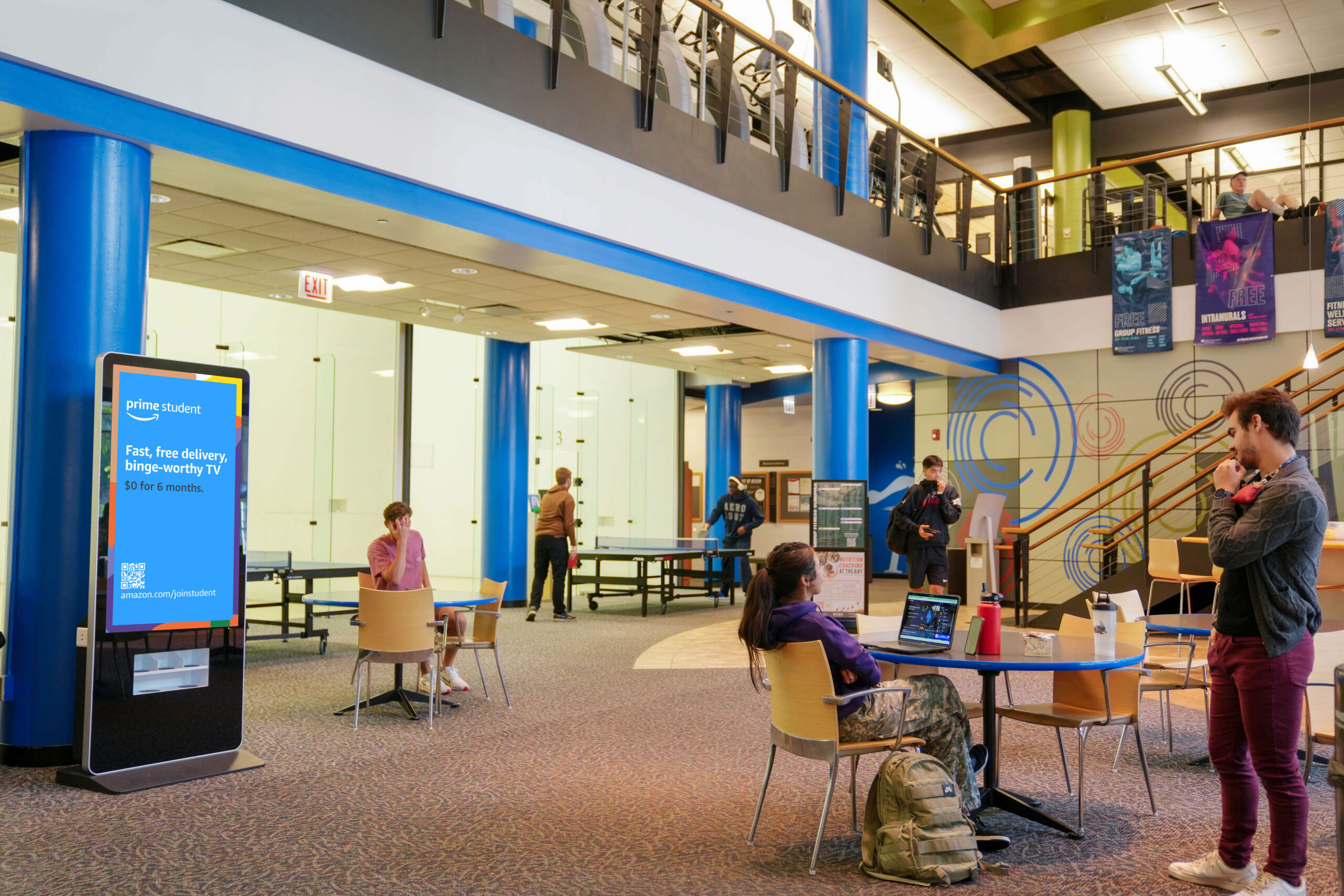
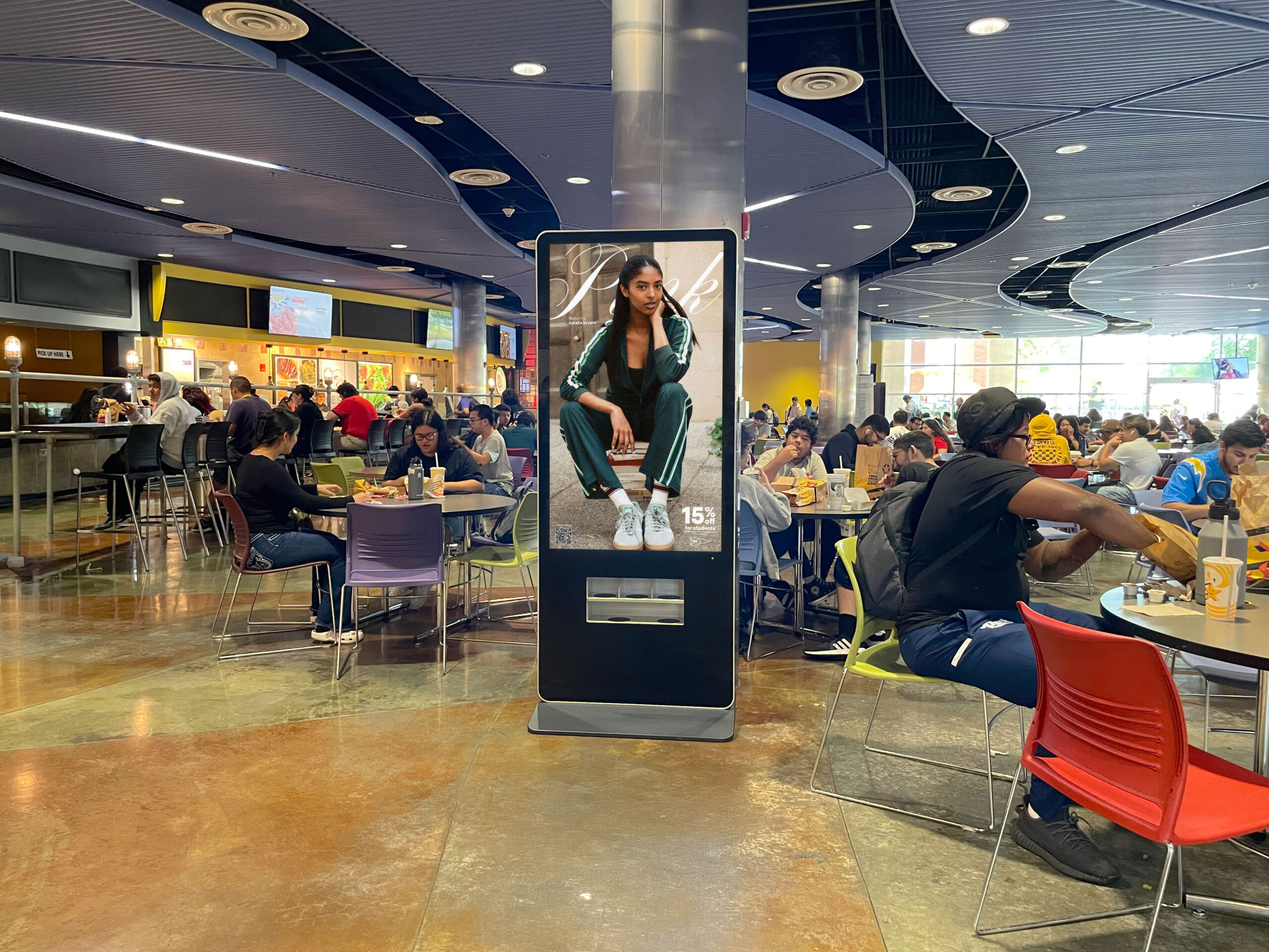
The new website brings Trooh to life with striking visuals of our screens in real environments while authentically representing our target audience.
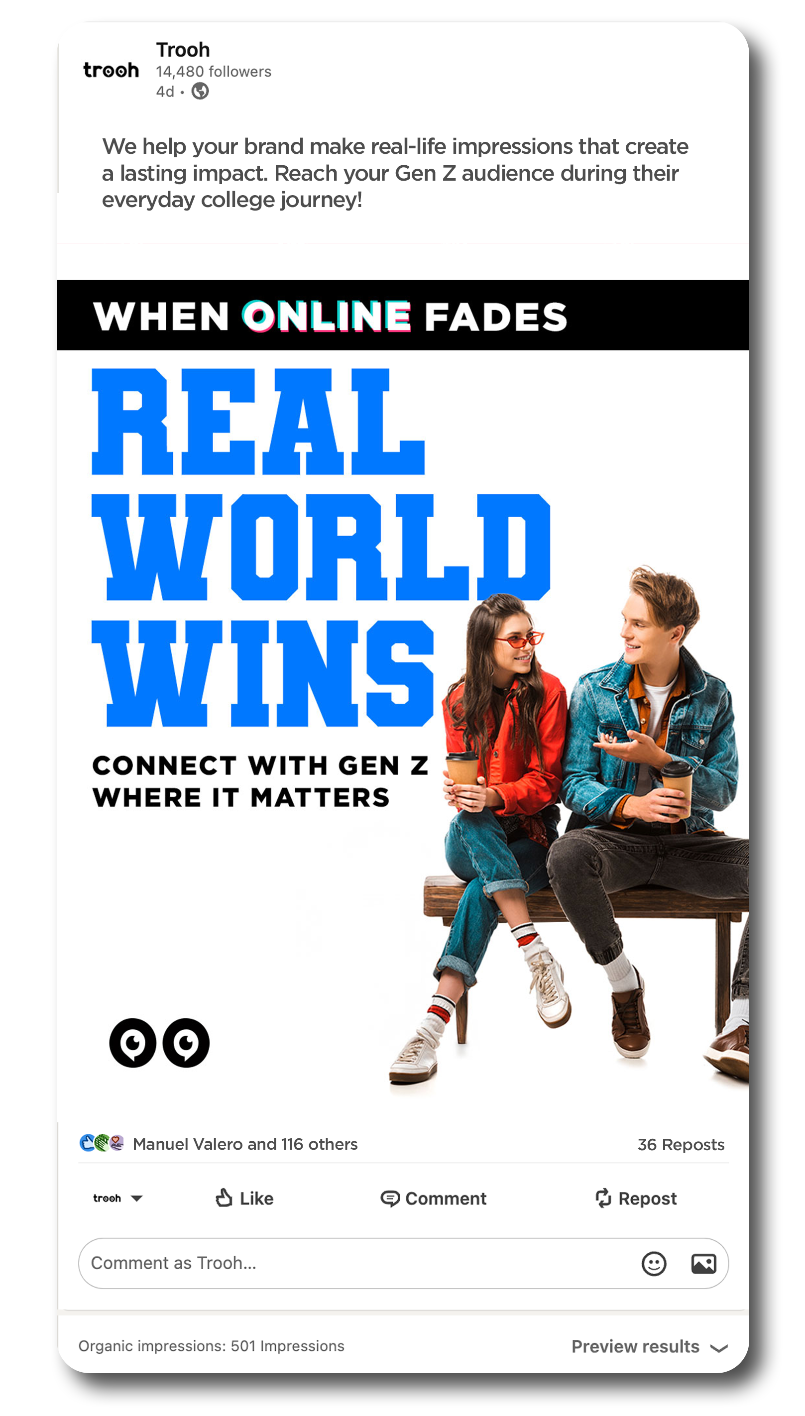
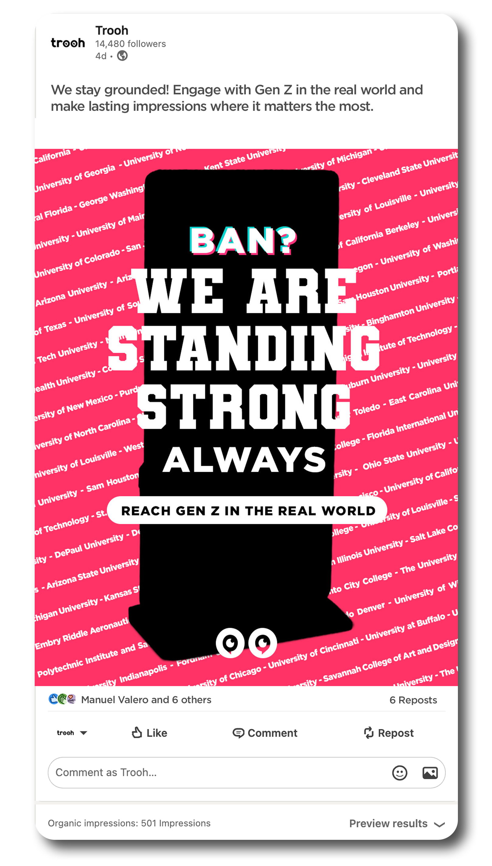
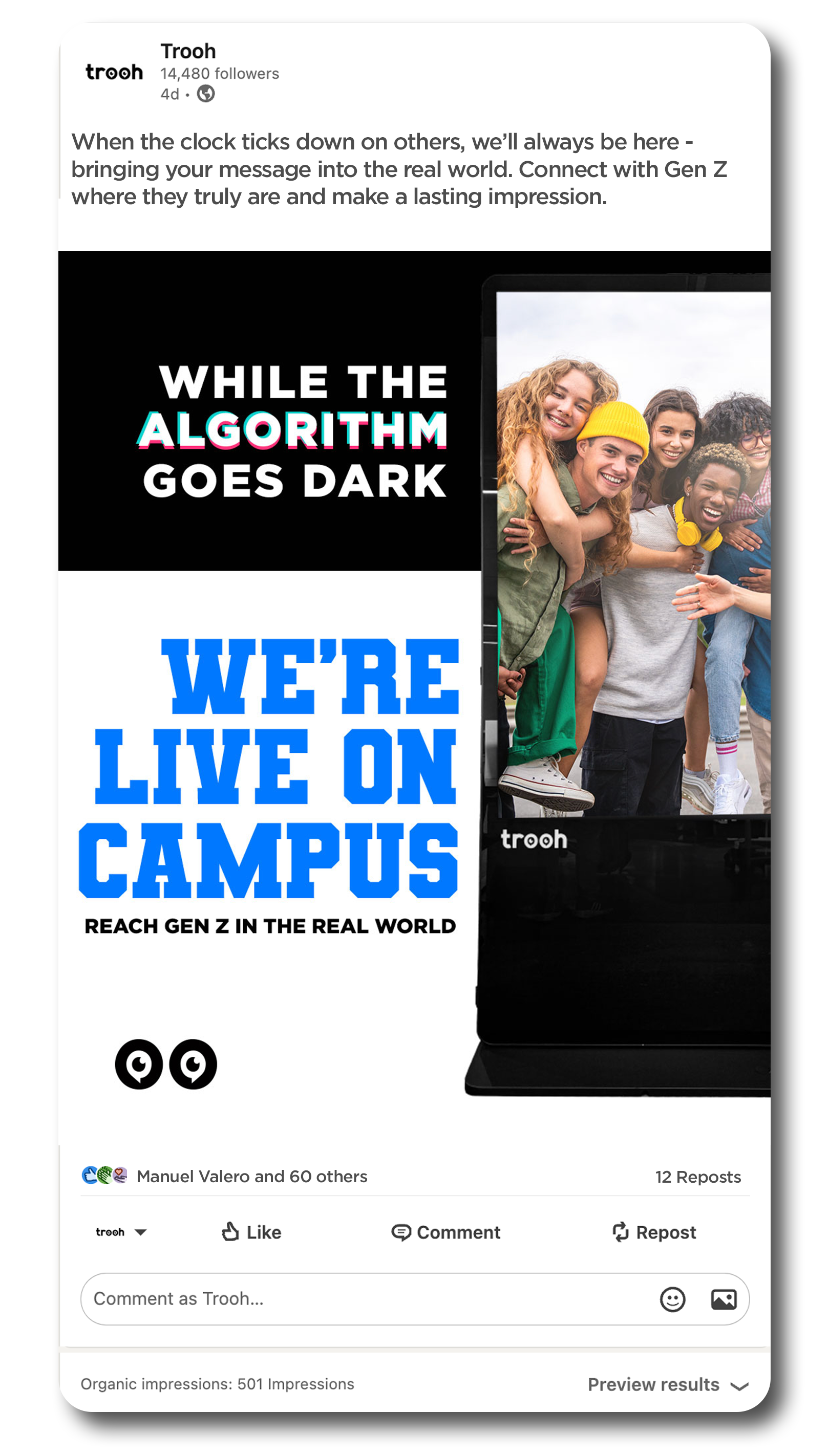
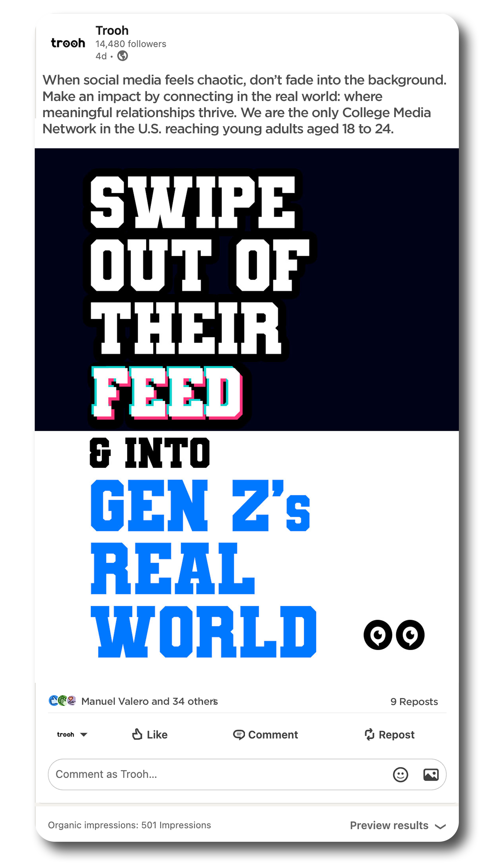
Focusing on Gen Z and adopting this new tone empowered me to take creative risks on social media. With TikTok facing potential bans in the U.S., we launched an aggressive yet impactful campaign aimed directly at advertisers.
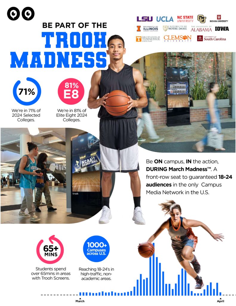
Sales One Pagers
As part of the rebrand, I created one-pagers highlighting key events such as March Madness, boosting our sales strategy and improving client communications during peak moments.
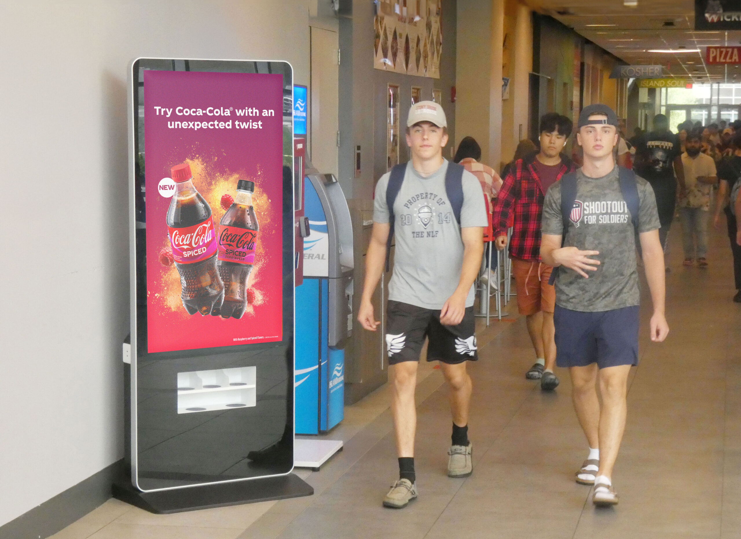
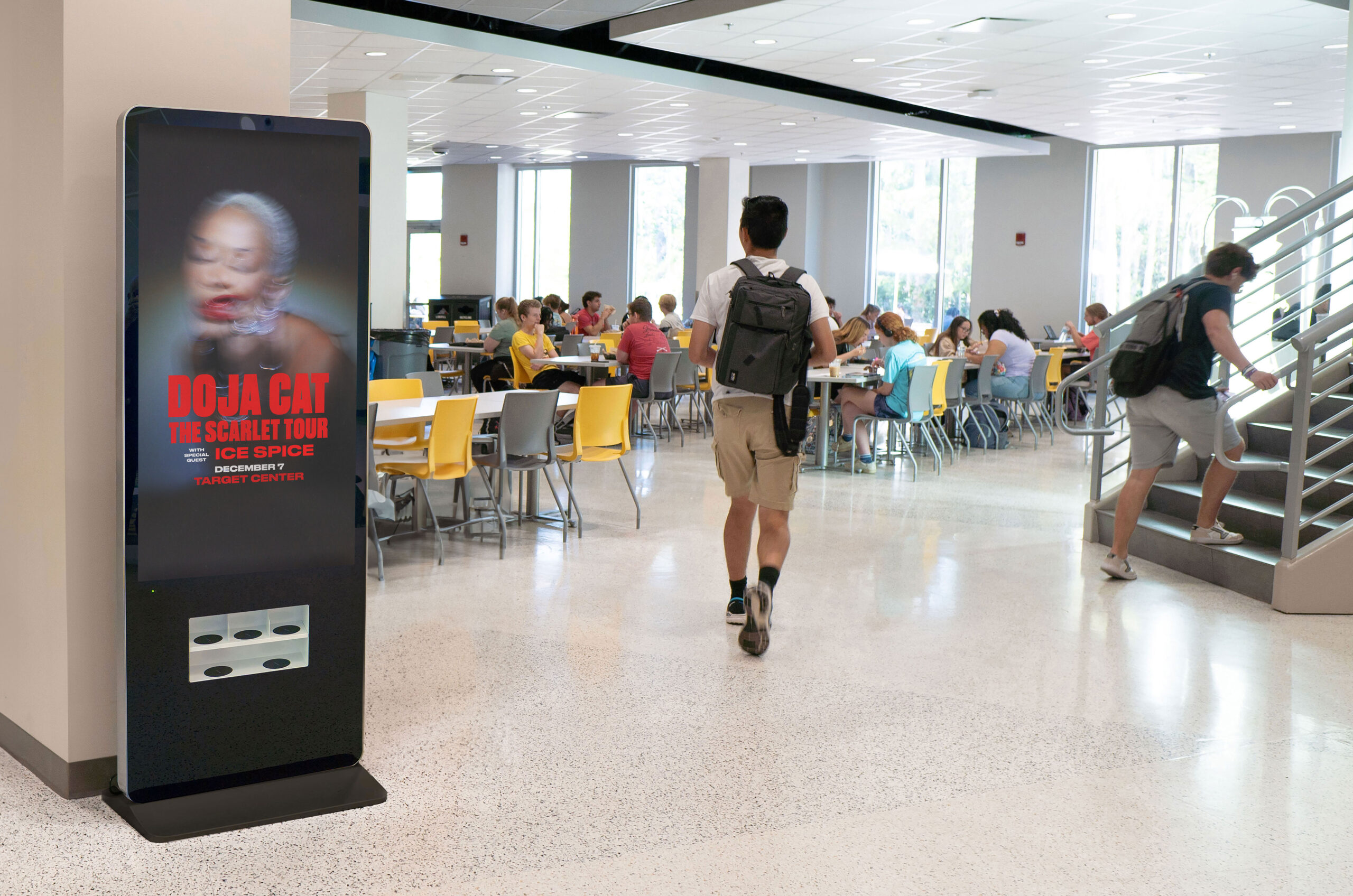
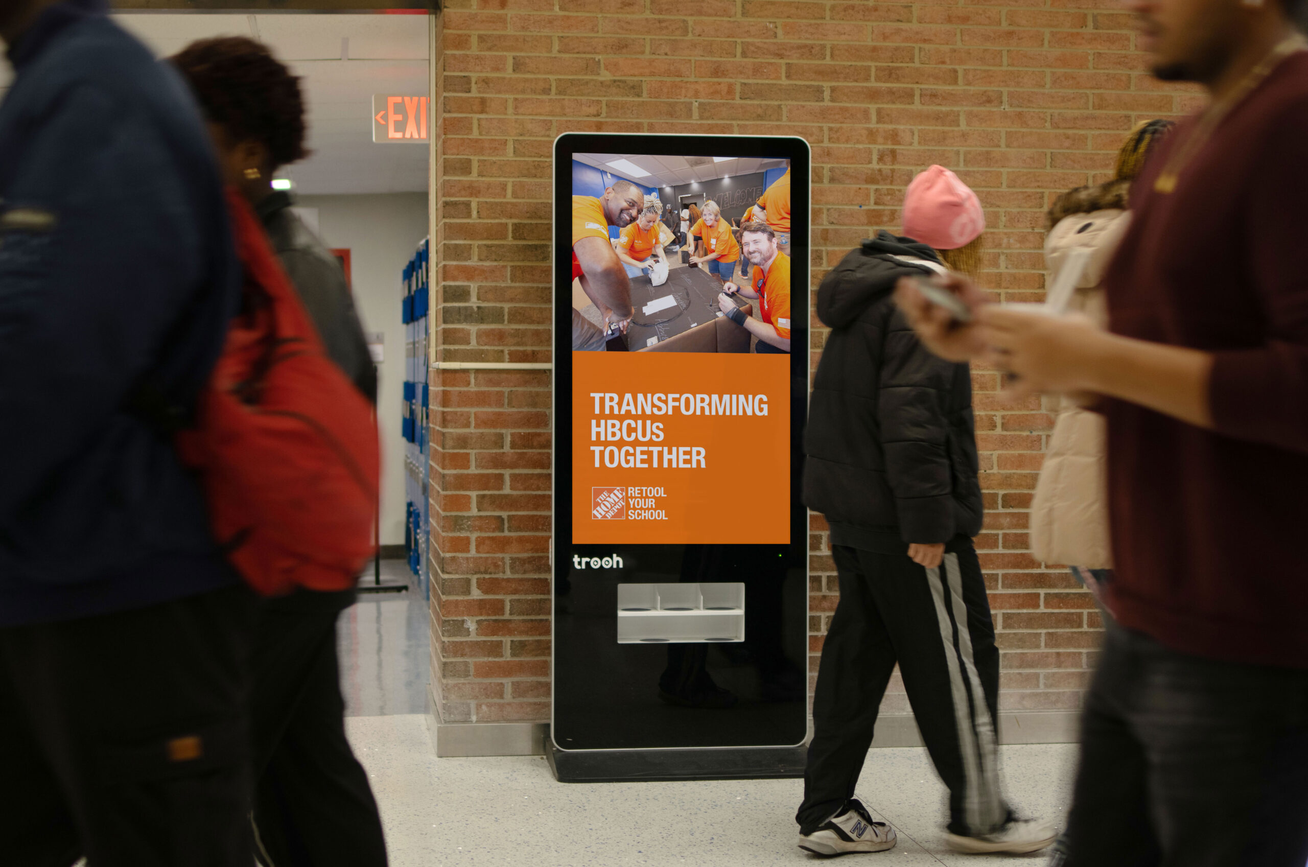
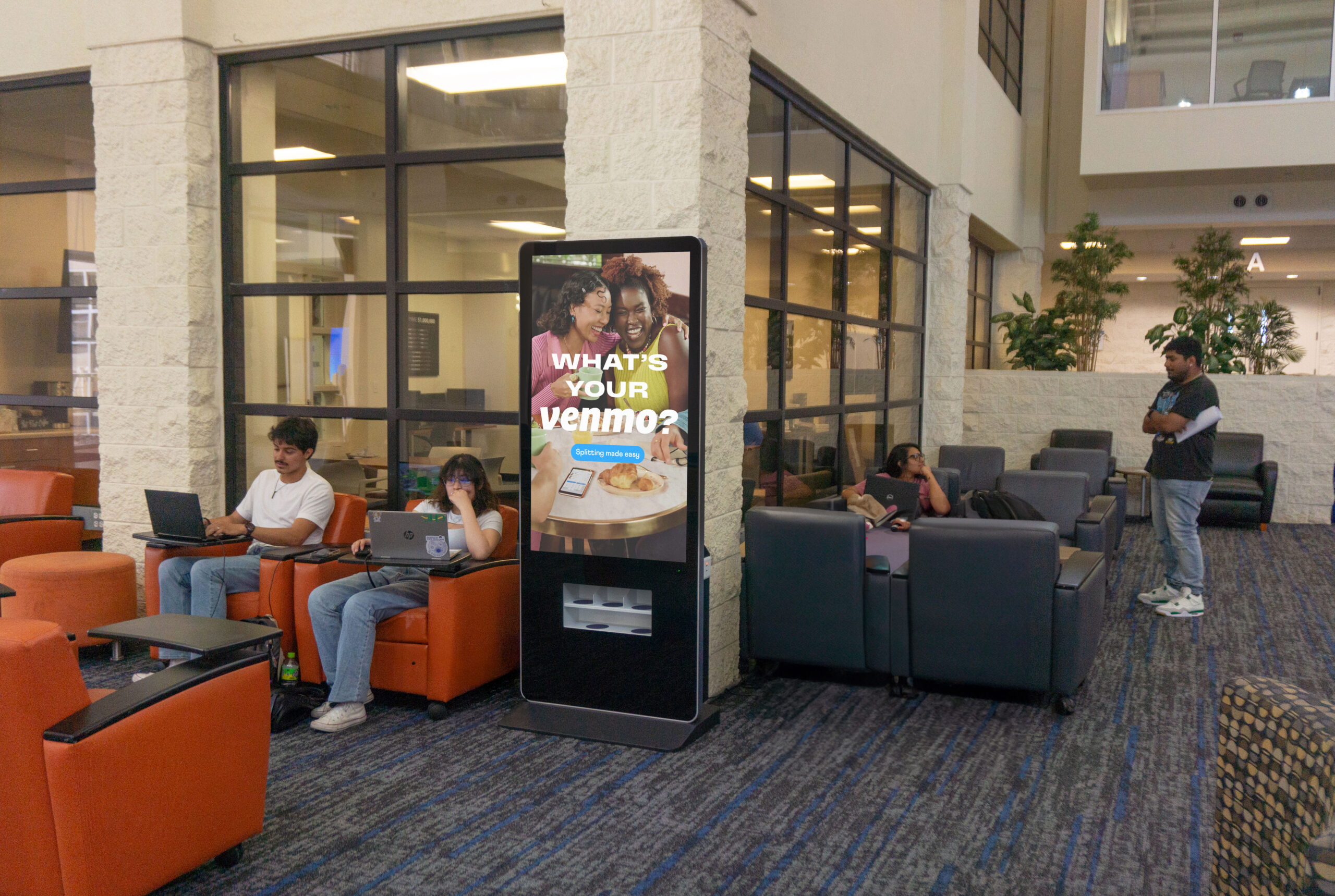
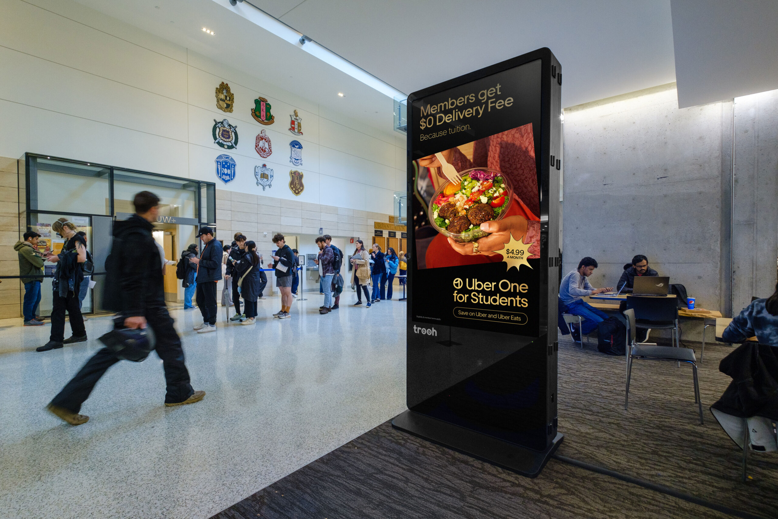
Photo Collection
To demonstrate the scale of our network and the impact of our large-format screens, I coordinated photo shoots across 49 U.S. states, capturing busy locations at peak times. These photos were transformed into mockups used as marketing materials for the sales team.